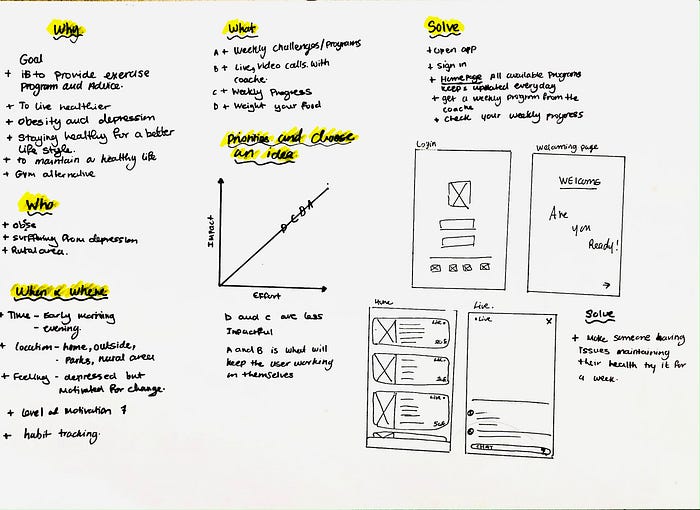
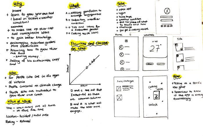
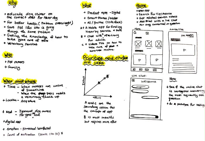
In week 5 we were asked to analyse three client briefs and choose one. The method used is the 7 step canvas framework. This is to better understand the brief.
The briefs analysis is as follows:
In the same week, we had to design three concepts provided by the client. Those concepts include Context, aesthetics,s and accessibilities.
The first concept is context. The client had a specific user group that is Australian living in living in dense inner-city urban areas with very little space to grow food. Therefore in my design, I had to consider how they would grow their plant in a little space as well as the weather conditions in Australia.
Therefore, the home page shows the users their current weather conditions depending on their location this will automatically generate content for the user. From there users can now browse how to grow plants in small areas. They have various ways to learn how through videos and step-by-step descriptive instruction.
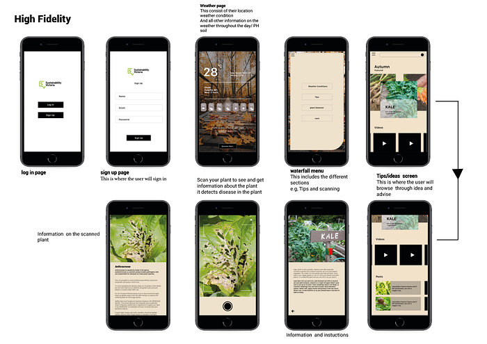
The second concept is the aesthetic. The client asks to use a specific design language that’s the Photon design language developed by Firefox. Below is a screenshot for a more in-depth explanation of the concept.
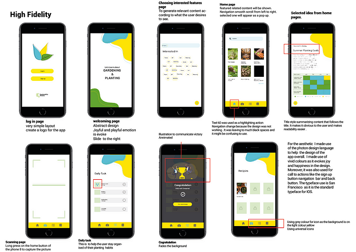
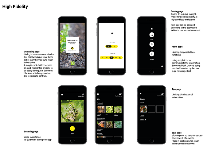
The third concept is accessibility. This concept is for people with low vision with high contrast big fonts. Below is a screenshot for a more in-depth explanation of the concept.
