Blog part 1
Designing a mental health app for c-care — A UX designer case study
Project name : BetterDays
Mental health is fundamental to the state of our well-being. It helps to control stress, helps people to understand their self-ability, and acquire skills and work efficiently. However, not everyone has the same strength to handle their mental health which can lead to a bad health for both mental and physical state.
BUT WHAT IF THERE WAS A WAY TO BUILD JUST ENOUGH OF STRENGTH?
The client

c- care is one of the pioneer medical providers in Mauritius. They believe that health care is more than just treatment and cure. Rather they fully take care of a person’s mind, body and spirit. Their healthcare approach is based on compassion, treating patients and their families with kindness, understanding and respect. Additionally, they are looking to design and make a web application that will help people who are going through mental health issues such as anxiety and depression and how this will help them overcome their current state of mind as well as keep track of their well-being/mental- health progression.
List of possible factors affecting people decision making in therapy session at the clinic - (problems)
‣ Not easily accessible anywhere any time- the patient needs to be physically present for an appointment
‣ Time consuming- Travelling long distance examples people living in the suburb area and for people not in their good state of mind; it can be stressful and not safe for them.
‣ Limits the patient interaction with the doctor as they have no other option than a face to face therapy session at the clinic
‣ Some don’t feel at ease or comfortable with the clinic setting or environment
‣ Waiting time can be exhausting at the clinic if an individual did not book an appointment.
‣It is difficult to keep track of mental health progression/journey prescribe by the doctors as once the appointment is over it is up to the individual to have a follow up.

Assumption was made to help us understand how our goal better and how it might fail theses are a set of question and are as follows:
· Is it appropriate to a global target audience?
· will it accessible on any devices?
· How to reach out?
· Will it help people’s mental health as well as motivate them?
· Will this encourage continues use of the web app?
· Why will they need this web app?
· What if the individual does not have internet?
· How will they know if the exercises are done properly?
· Will it track their progress?

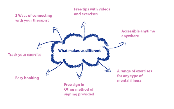
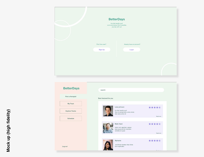
Why should you sign up?
DESIGN RESEARCH
Throughout my case studies, I found that most web applications don’t have the features to chat or call or choose a specific therapist to have real-life time conversations; instead, it is automated with questions generated already on the chat itself, to which most are payable. This can leave the patient frustrated, especially if they are mentally ill. Therefore, this is one of the main features in tackling the problem of someone who doesn’t feel at ease with the clinical setting/environment and giving them the option of how they want to connect with their therapist and, most importantly, someone who needs immediate attention.
I researched on design trends to which I got inspired to design the web app and are as follows:-
‣ Engaging interactives
- Engaging Interactives can be divided into several categories: visual effects, sound stimulation, database incorporation, and fast reaction code.
- The simplest way for a platform to become engaging is to include forms, opinion surveys, and other surveys that allow customers to effortlessly input feedback or submit queries for details.
- An interactive application can encourage sharing, encouraging visitors to share their personal experiences. Although an individual can engage with the platform, user may not need that interaction. They may simply want details about something without feeling obligated to engage in any experience.
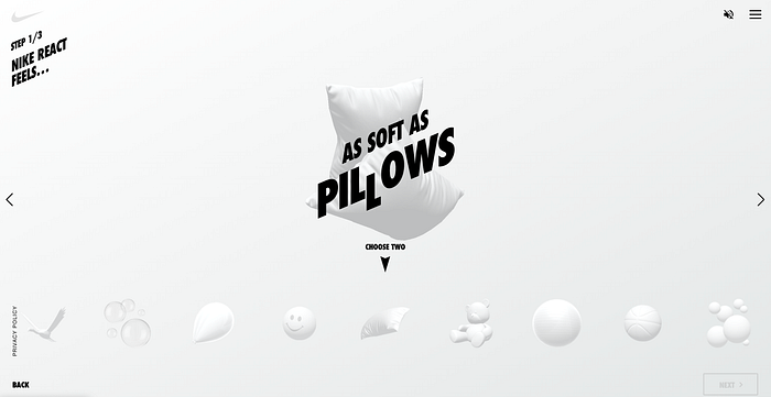
You can design your own React running shoes using enjoyable, smooth animation and eye-catching visuals on this interactive website. But you’re not making shoes in the traditional sense. Instead of stitches and fabrics, you can use bubbles, stress balls, springs, and other materials. These entertaining visuals increase user engagement while selling the idea that Nike’s React footwear is extremely comfortable.
‣ Creative scrolling experience
-Fixed long scrolling sites present information that would normally require multiple segments within a single long-scrolling segment. Also, when determining what to add in a fixed scroll segment, it’s better to stick to a single theme or section. Moreover, a “tap and hold progress bar” from a UXPin can also be considered for the navigation. If the trend has more than 3–4 frames, it assists to add a sense of rhythm.
- When scrolling, the components of a two-dimensional image move at different speeds, creating the parallax effect pattern. The main picture and background are shifting at different speeds, or the background has various layers. The effect gives the illusion of three dimensions. It enables more creative scrolling, especially when paired with scroll-triggered graphics. thus, creating a more submurged and stimulating experience
‣ Transparent elements
- Transparent elements are a technique for achieving a lightweight visual style by allowing on-screen features to ‘float’ on the display. They are also known as glass morphism
- Layering is one of the four primary design features of glass morphism which means stacking one element on top of another instead of redirecting users to a new display
- Colors that stand out to help people distinguish actionable components.

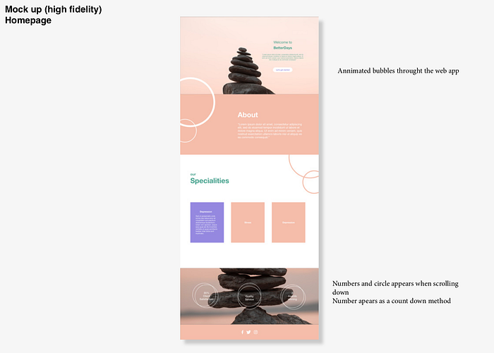
DESIGN PROPOSALS
CONCEPTS 1
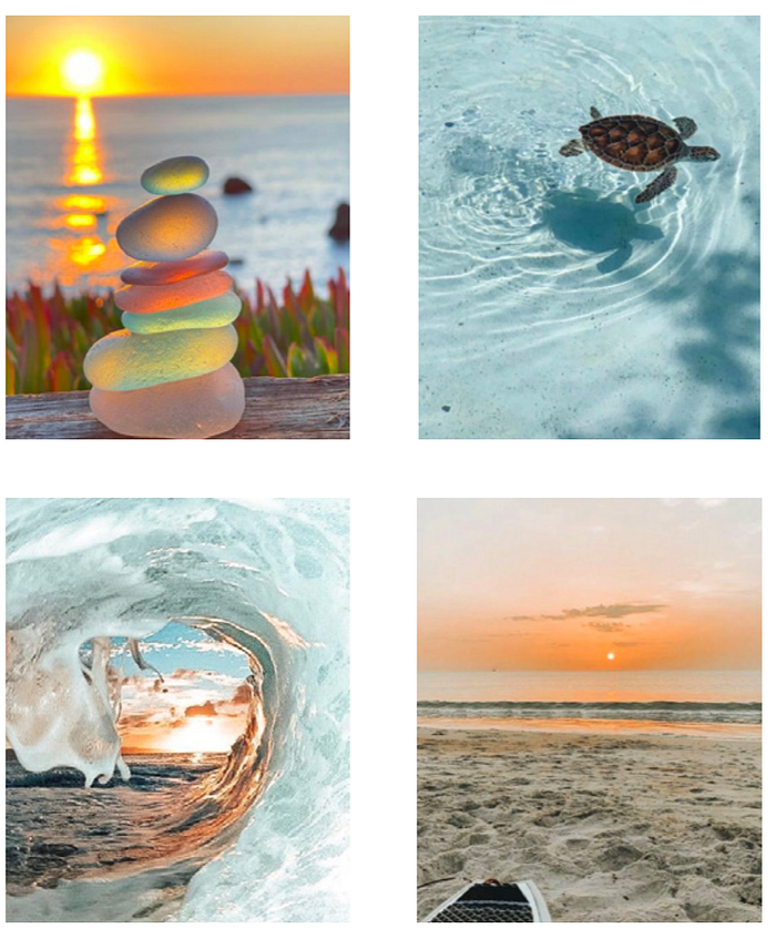
This moodboard represent the look and feel of the web application for concept 1. This is how i want the web application to be perceived as; calm as the sea and relaxing as the sun sets. Moreover the colours were picked from the images.
WHY the sea because research shows from “The Guardient” ,Dr Mathew White, says that living by the sea environment people are more active as well as water has a ‘psychologically restorative effect leading to a positive mood and reduced negative mood and stress. (Stephen Jobling, 2021)

CONCEPT 2
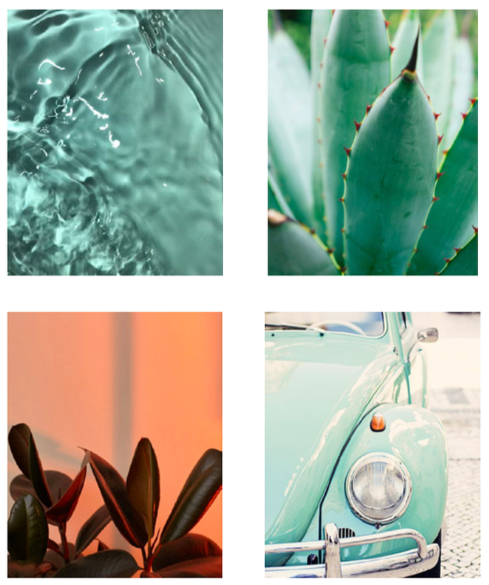
This moodboard represent freshness; freshness of the water, freshness of plants and a newly fresh painted car. The dominant colour is the minty green. This helps helps people feel rested and secure. The color green is very effectively to get your attention and give you a sense of ease to get started with a product.
CONCEPT 3
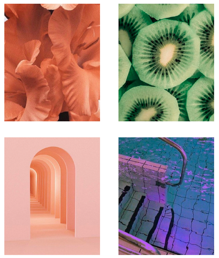
This moodboard represent a pastel aesthetic.
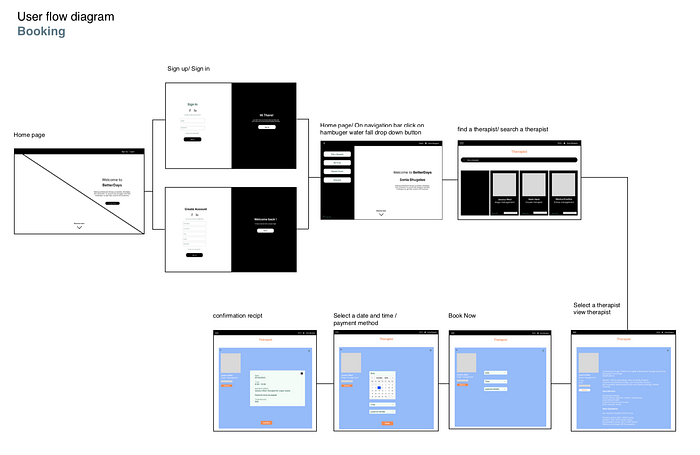
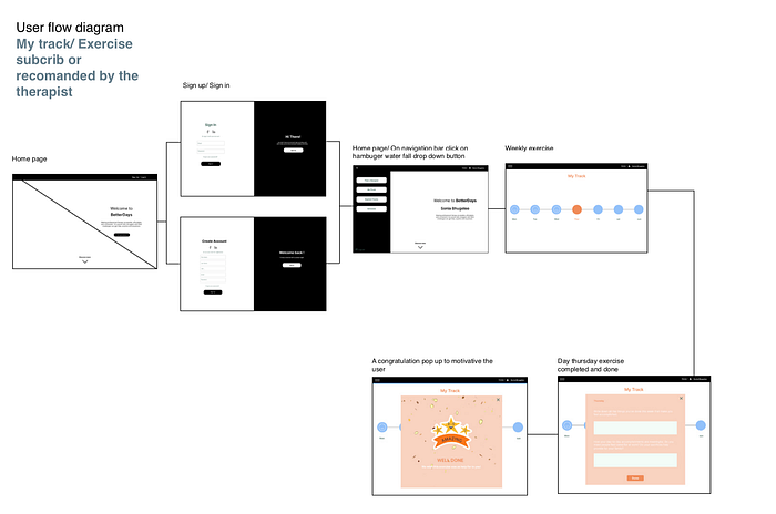
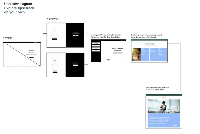
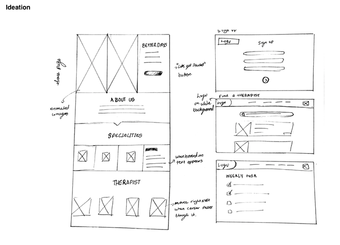
USER FLOW DIAGRAM